2022.01.11
Appeal decision report (PRINCE HOTEL)
January 11, 2022
Tatsuya Kimura
| Appeal number | Invalidation 2020-890029(JP. Reg. No. 5750467) |
|---|---|
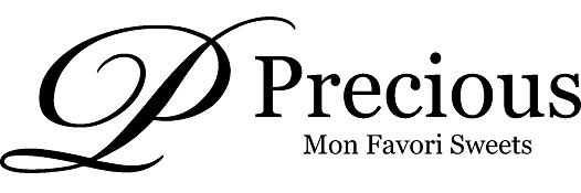
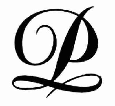
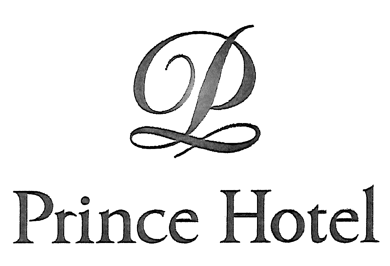
| Case summary | There is no likelihood of confusion between two marks even though both have a cursive-style logo with the Latin letter “P” as a motif because there is a remarkable difference in the degree of inclination of the logo and in the bottom of the logo which is shaped like “∞.” |
| Date of decision | December 2, 2020 |
| Demandant (Applicant) | Prince Hotels Inc. |
| Trademark(s) |
Subject trademark Cited mark No. 1 Cited mark No. 2 |
| Designated Goods and Class(es)) |
Tea, prepared coffee and prepared cocoa, confectionery, bread and buns, shaved ice confections in class 30. |
| Judgement |
Similarity between marks and the likelihood of confusion (1) Trademark in Question The Trademark is a cursive-style logo with the Latin letter “P” as a motif, with the “P Logo” tilted to the right, the letters “Precious” on the right, and a smaller “Mon Favori” below it. The letters “Sweets” are arranged respectively. The “P logo” can be viewed separately from the Latin characters of “Precious” and “Mon Favori Sweets” on the right side. (2) Cited Trademarks Cited Trademark 1 consists of an upright cursive-style Latin letter “P” as a motif, and a “P logo” in which the lower sides of the vertical bar is folded to draw “∞.” (3) Similarity between the Trademark and the Cited Trademarks The “P Logo” is the dominant part of the Trademark and the Cited Trademarks. Although both logos have the Latin letter “P” as a motif, the degree of inclination of the logo is significantly different, and the lower side connected from the vertical bar is folded to draw “∞.” There is a remarkable difference in whether it is a ribbon-like final stroke in the form of “∞,” so even if you observe it separately, they should be distinguishable from each other. |
| Comments |
At first glance, the P logo parts of the Trademark and the Cited Trademarks appear to be similar. However, a cursive-style logo is common as a script typeface of Latin characters, and in the end, the distinctive feature of the P logos of the Cited Trademarks is that the vertical bar is folded to draw “∞.” Accordingly, it is judged that there is no risk of being confused with the Trademark that does not have the feature. |